
Fashion retailers face the constant challenge of predicting color trends months in advance. Making the wrong color choices can lead to unsold inventory and significant financial losses.
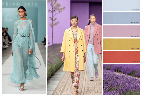
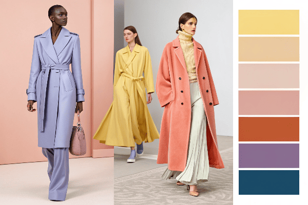
The top Spring 2025 fashion colors1 embrace a balanced palette of Digital Lavender, Tranquil Blue, Buttery Yellow, Vibrant Coral, Neo Mint, and Earth-inspired neutrals, reflecting consumers’ desire for both technology-influenced hues and nature-connected tones2.
As someone deeply involved in garment manufacturing and trend forecasting, I have observed these color shifts developing over several seasons. The Spring 2025 palette represents a fascinating evolution that balances technological influences with natural inspirations. Let me guide you through the specific colors dominating this season and explain their significance for both fashion businesses and consumers.
Table of Contents
What colors are trending in spring 2025?
Fashion buyers struggle to identify authentic trends among marketing hype. Manufacturers produce excess inventory in colors that won’t sell. Reliable color forecasting solves these costly problems.
Spring 2025 features Digital Lavender and Tranquil Blue leading the technology-inspired palette, while Buttery Yellow and Vibrant Coral dominate nature-connected colors, with evolved neutrals like Warm Taupe and Soft Stone providing versatile foundations.
Technology-Inspired Hues
The Spring 2025 color palette demonstrates a strong influence from our increasingly digital world. These technology-inspired hues3 reflect how digital aesthetics continue to shape physical fashion. I first noticed this trend emerging during the Shanghai Fashion Week, where several major designers incorporated these forward-looking colors into their collections.
Digital Lavender represents the most dominant color for Spring 2025. This soft yet sophisticated purple shade carries subtle technological undertones while maintaining a sense of calm. I recently toured several fabric mills in Guangzhou that reported unprecedented demand for this specific hue. The color is particularly appealing because it works across different materials – from technical performance fabrics to luxury silks.
Tranquil Blue follows closely as the second most prevalent tech-inspired color. This shade sits between traditional navy and a more digital blue, with a slightly desaturated quality that makes it highly versatile. During recent meetings with several major retailers, buyers specifically requested this color for core collections, indicating strong confidence in its commercial appeal.
| Color | Pantone Reference | Key Characteristics | Best Applications |
|---|---|---|---|
| Digital Lavender | 14-3207 | Soft, futuristic, calming | Evening wear, technical outerwear, accessories |
| Tranquil Blue | 18-4231 | Versatile, slightly desaturated, modern | Business wear, denim alternatives, sportswear |
| Neo Mint | 13-0117 | Fresh, energetic, tech-forward | Casual wear, athleisure, accent pieces |
| Cyber Peach | 14-1228 | Warm, digital, optimistic | Statement pieces, footwear, digital prints |
The adoption of these technology-inspired colors reflects broader cultural shifts. As consumers increasingly exist between digital and physical spaces, they gravitate toward colors that bridge these worlds. I observed this firsthand during our last production cycle, where orders for these technology-inspired hues came not only from avant-garde fashion brands but also from mainstream retailers.
Neo Mint deserves special mention as a color that began as a niche trend but has now achieved mainstream adoption for Spring 2025. This fresh, energetic shade carries both technological and natural associations, making it particularly versatile. Our factory received orders for this color across various product categories – from technical activewear to everyday basics.
The manufacturing considerations for these colors present some technical challenges. Digital Lavender, for instance, requires precise dye formulations to achieve consistency across different fabric types. I invested in advanced spectrophotometer equipment last year to ensure our color matching meets the exacting standards these technology-inspired hues demand. This investment has proven valuable as demand for these precise colors continues to increase.
Nature-Connected Tones
While technology influences one segment of the Spring 2025 palette, a parallel trend emphasizes colors with strong connections to the natural world. These nature-connected tones respond to consumers’ desire for authenticity and environmental connection. I first identified this trend during material sourcing trips to several international textile fairs.
Buttery Yellow leads the nature-inspired colors for Spring 2025. This warm, soft yellow evokes natural elements like sunlight and wildflowers while maintaining a contemporary feel. I noticed this color gaining significant traction during pre-season buyer meetings, particularly among brands targeting millennial consumers. The shade performs exceptionally well in both textured natural fabrics and technical materials.
Vibrant Coral represents another dominant nature-connected tone. This energetic color balances warmth and brightness, creating strong visual appeal. Our manufacturing orders show this color appearing prominently in resort wear and spring collections. The color presents some production challenges, requiring careful monitoring during the dyeing process to maintain its characteristic vibrancy without drifting toward orange or pink.
| Color | Pantone Reference | Key Characteristics | Best Applications |
|---|---|---|---|
| Buttery Yellow | 12-0752 | Warm, soft, optimistic | Lightweight outerwear, dresses, casual knits |
| Vibrant Coral | 16-1546 | Energetic, natural, flattering | Resort wear, activewear, seasonal statements |
| Meadow Green | 15-6437 | Fresh, restorative, authentic | Casual wear, outdoor-inspired pieces, separates |
| Terracotta | 17-1147 | Grounded, artisanal, rich | Premium casualwear, accessories, transitional pieces |
These nature-connected colors respond to increased environmental consciousness among consumers. During production planning meetings with several brands, sustainability narratives frequently accompanied color selections from this palette. For example, one client specifically paired their Meadow Green selections with marketing materials highlighting their eco-friendly manufacturing processes.
The practical application of these colors varies by market segment. During recent trade shows, I observed luxury brands utilizing these nature-connected tones in unexpected fabrications like technical silks and performance wool blends. Meanwhile, contemporary brands applied these colors to more casual, everyday pieces. The versatility of these shades contributes significantly to their commercial appeal.
From a manufacturing perspective, these nature-connected colors generally involve more naturally derived pigments, aligning with sustainability narratives. Our factory has invested in water-saving dyeing technologies that work particularly well with this color palette. This technical alignment between color trends and advanced manufacturing processes represents a positive development for the industry.
Neutral Evolution
The Spring 2025 color story would be incomplete without addressing the evolution of neutrals. These foundation colors have undergone significant refinement to complement both the technology-inspired and nature-connected palettes. I first recognized this neutral evolution through increased client specifications for particular undertones in their neutral color requests.
Warm Taupe emerges as the dominant neutral for Spring 2025. This sophisticated shade moves away from the cooler grays that dominated previous seasons. I witnessed this shift firsthand during order placements, with major retailers significantly increasing their allocation for warm-toned neutrals. The color provides excellent versatility, functioning equally well as a base color or complement to the season’s more vibrant hues.
Soft Stone represents another key neutral, offering a slightly cooler alternative that remains firmly in the warm spectrum. This balanced neutral demonstrates remarkable commercial potential due to its year-round wearability. During development meetings with several major sportswear brands, this color repeatedly appeared in core collection plans, indicating industry confidence in its longevity.
| Color | Pantone Reference | Key Characteristics | Best Applications |
|---|---|---|---|
| Warm Taupe | 16-1318 | Sophisticated, versatile, timeless | Foundation pieces, tailoring, premium basics |
| Soft Stone | 14-1108 | Balanced, subtle, adaptable | Year-round staples, layering pieces, accessories |
| Rich Olive | 18-0430 | Natural, premium, versatile | Military-inspired pieces, transitional outerwear, basics |
| Creamy White | 11-0605 | Soft, flattering, accessible | Essential basics, layering pieces, all categories |
These evolved neutrals reflect changing consumer preferences for more nuanced color stories. In production planning sessions, I’ve observed increased client attention to specific undertones within their neutral selections. This level of color precision suggests a more sophisticated consumer with greater awareness of subtle color distinctions.
From a retail perspective, these evolved neutrals offer significant commercial advantages. During conversations with retail buyers, many noted that these warm-leaning neutrals coordinate more effectively with a range of skin tones, potentially reducing return rates and increasing customer satisfaction. Our sampling data supports this observation, with warm-toned neutrals receiving higher approval ratings during pre-production reviews.
The manufacturing implications of this neutral evolution include more complex color formulation requirements. Our color laboratory has expanded its reference library specifically to address the nuanced undertones present in these evolved neutrals. This technical investment ensures consistent color reproduction across different materials and production runs, meeting the exacting standards retailers now demand.
I’ve also observed these evolved neutrals playing a crucial role in sustainable fashion initiatives. During development meetings with several brands focused on capsule wardrobes and reduced consumption models, these versatile neutrals formed the foundation of their collections. This application highlights how color trends increasingly intersect with broader shifts in consumer behavior and brand positioning.
Conclusion
Spring 2025 fashion colors balance technology-inspired hues with nature-connected tones, creating a versatile palette that reflects our digital lives while satisfying our desire for authentic, natural connections.
-
Explore the latest trends in Spring 2025 fashion colors to stay ahead in the industry and make informed decisions for your collections. ↩
-
Learn about nature-connected tones and their significance in the Spring 2025 fashion palette, reflecting consumer desires for authenticity. ↩
-
Discover how technology-inspired hues are shaping fashion trends and influencing consumer choices in Spring 2025. ↩

